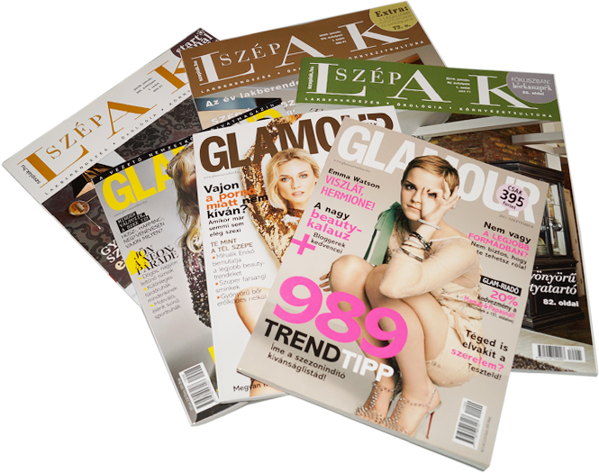
Ten mistakes – you should avoid when ordering a printed publication.
When planning and composing a printed publication—whether it is an advertisement, a catalogue, a brochure, a magazine or a book—it is useful to know the basic formatting requirements regarding the material before handing it in. This can save you a significant amount of time during the preparation phase, and it also makes it easier for layout editors to do their job. Therefore, we decided to list the most common mistakes our clients made over the past few years, and we also give some advice on how to avoid them.
Content formatted as a Word file
Many people send nicely formatted text documents to prepress professionals, which are often useless for them. The reason for this is that the programs used for text composition redefine the visual appearance of the document, therefore any previous formatting is deleted or revised. Keeping this in mind, it is easier to use only paragraphs for defining the text layout to save time during the preparation phase.
Embedded images in a Word file
Clients often paste images into text files before submitting them for preparation. More often than not, these images cannot be used. If the accurate placement of the images is important, it is recommended to reference the file name in the text file and send the images attached separately..
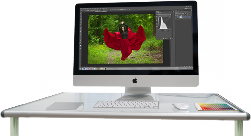
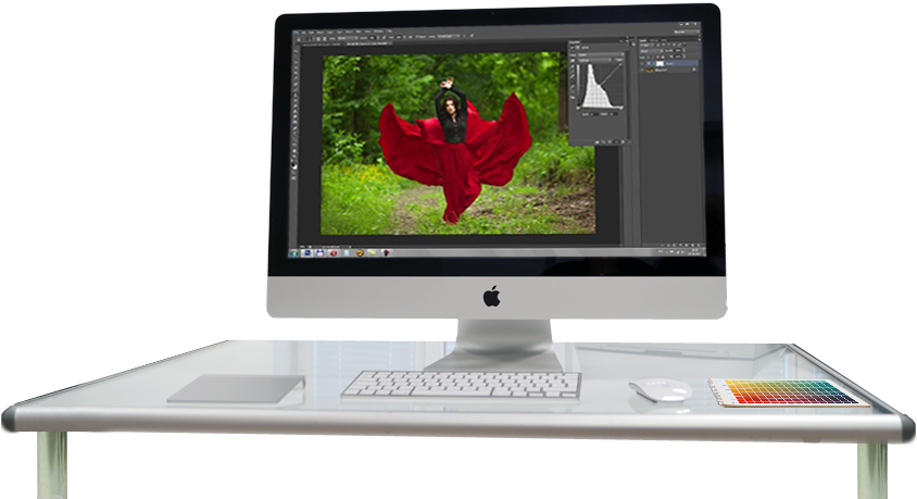
Resolution of the image
Misunderstanding the properties of the on-screen image is also a common mistake. The main reason for this is that the resolution of screens is completely different from that of printing machines, so what looked good on-screen can be poor quality when printed. This problem has already been outlined in detail in another article, so here we only mention the two most important requirements: the images sent must have a resolution of 300 dpi and they should use the CMYK color model.
Character set used
It is recommended to check if the chosen font contains the Hungarian "ő" and "ű" characters, as subsequent correction can be an extremely time-consuming job. The best method is to check with the professionals: ask for advice on the characters to use, so that the replacement of the characters can be made globally.
Just a simple publication
Most people think that they have simple expectations, though many times it is quite the opposite when it comes to implementation. As a consequence, they leave everything to the last moment, and what should have been an easy and quick job usually results in a mess rather than a carefully planned concept. It is very important to carefully consider the different options, and to ask the studio professionals for advice—right from the early phases of the designing process, if necessary—as a good concept can be used for years with only content updates.
The balance between quality and price
It is important to consider the financial resources available for producing a printed product. Creating an impressive appearance is not necessarily expensive, as an engaging graphic design can compensate for a low budget. However, it is true that certain quality requirements have their price. In these cases technology (offset or digital) and the additional processes used (punching, foil blocking or spot varnishing) significantly affect the quality of the appearance—and the prices too. A common mistake is that printing a well-designed publication in poor quality or using quality materials for a weak design. We can help you find the perfect balance at an affordable price.
Check with your own eyes
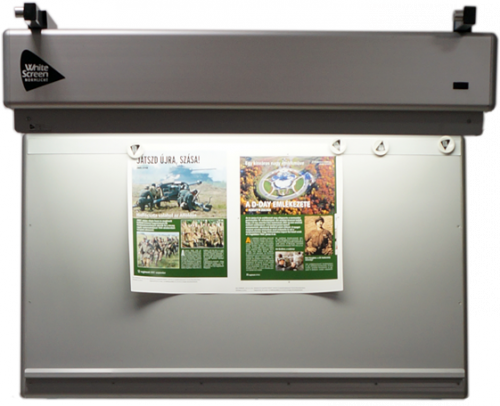
It is a very important factor to consider that the colors shown on-screen can look totally different in print. Therefore, always ask for a color correct digital proof before initiating the printing phase. This way, there will be no disappointment afterwards regarding the appearance of the document, and no dispute will arise with the printing service provider about who made the mistake, as the files can still be changed. This can save you a significant amount of time, money and annoyance.
Don't choose unprepared providers!
Nowadays, price is a dominant factor for clients when choosing the provider for a job. However, putting the price first can often lead to disappointments. Low prices usually mean poor quality and lots of extra work that, in hindsight, require too much time and energy during the preparation phase of the publication—it is just not worth it. And last but not least, warranty is essential. WellCom Studio is committed to offering the highest quality service to all of its clients.
Spoken words fly away
Another important factor is to mutually clarify expectations. All clients want to have their needs precisely realised in the product. However, this requires clear communication. Avoid using phrases like: "You know what I mean…", "and it applies to the rest…", "I am sure you can handle this on your own…". It is essential to have clear objectives and appropriate expectations. This is the key to a successful cooperation.
Handling conflicts
If you notice any problems during the collaboration process, please report them immediately. It can save lots of extra work, and honesty strengthens the cooperation between partners
Following these pieces of advice can make the cooperation and planning process more efficient. WellCom uses its nineteen years of experience to provide all professional support necessary to help our partners become visible on the market with high-quality publications.
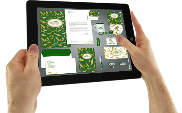
Madarat tolláról, céget arculatáról?
Miért fontos egy cég arculata?
Legfőképpen azért, mert egy érdeklődő gyakran előbb „találkozik” a vállalkozás arculatával, mint valamelyik képviselőjével.
The word typography is of Greek origin. It is derived from the words τυπος (typos) "type" and γραφω (graphein) "to write". The art of typography was born when block letters first appeared. It is the technique of forming the printed version of written communication.