Corporate Design
We show your best side!
The word typography is of Greek origin. It is derived from the words τυπος (typos) "type" and γραφω (graphein) "to write". The art of typography was born when block letters first appeared. It is the technique of forming the printed version of written communication. However, as time passed, typography - like any other science - underwent huge changes, mainly due to the introduction of digital content editing. In spite of the ongoing digital revolution, the rules for text compositions and page layout in print or on screens have not changed. Whether traditional books or e-books, high-quality publications are still characterized by typesetting best fit for comprehension and reading by the human eye.
Typography comprises of many different areas and a unified vision of these areas. Its most important (basic) building blocks are letters. Letters can take many forms, where shape, size and weight all matter. Without going into specific details, letters can be divided into two main groups based on their style characteristics. The first group, Antiqua letters are characterized by their decorative effect, the changing line weight and the application of serifs, while the other group, Linear Antiqua - also known as Grotesque - letters consist of sans-serif letters with optically balanced line weight. (We are planning to publish a more detailed article on letters shortly.)
Letters form words, sentences and textual contents. An important internal characteristic of these groups of letters is letter spacing, and their most important external characteristics are white spaces. In addition to these, the highest level of domain to take into consideration are gaps defined by other graphical elements. The optics of the factors above determines the reading experience. Here are the most important characteristics to pay attention to:

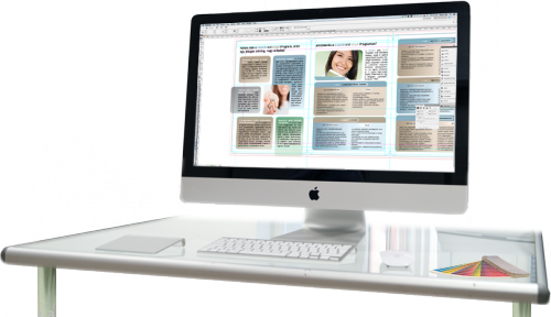
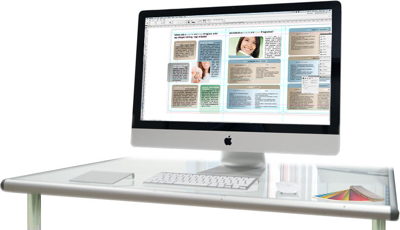
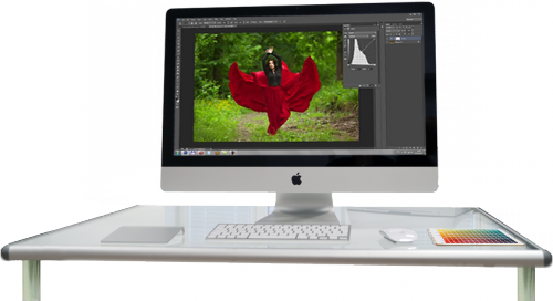
Aside from letters, other graphical elements - decorations, rules (lines dividing different parts of the text), images and other illustrations - determine the visual appearance of a publication. Positioning of these elements and aligning them with the text (wrapping text around or placing them above or below the text) requires special care and expertise. These strict rules on layout are usually not recognized by everyday readers. Still, when choosing from two publications where one of them is following the rules of typography and the other one is not, they will find the former easier to read and less demanding on the eyes.
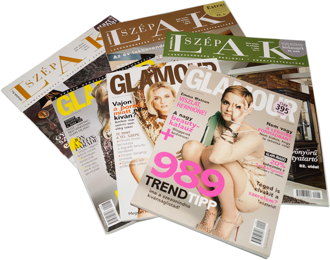
WellCom Studio, with its decades of experience and knowledge, aims to provide its partners with publications of the highest quality. You can rely on our expertise — we would like to hear from you.